Abductive reasoning is an important part of design thinking, and possibly the most difficult to get ok with.
Whether they realize it or not, designers live in Peirce’s world of abduction; they actively look for new data points, challenge accepted explanations, and infer possible new worlds.
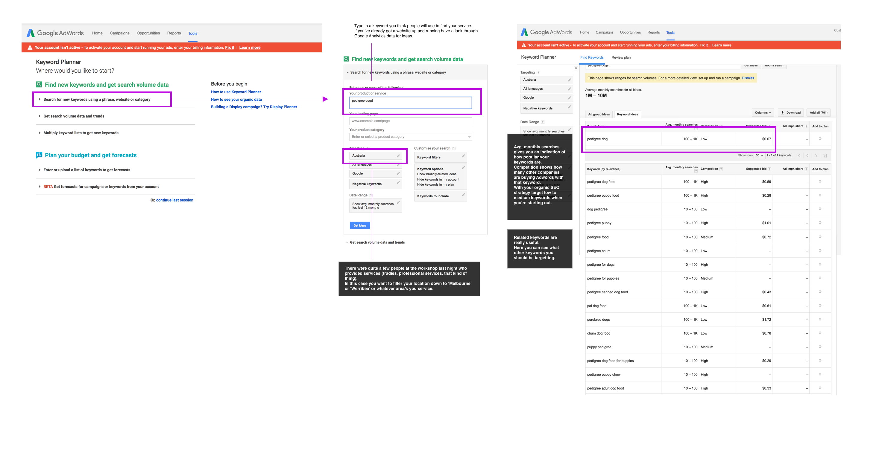
Last night I went to a Wyndham Small Business workshop. Every month or so there’s a free event covering different business-type stuff.
I know a little about SEO but not a heap. When you work in larger organisations that sort of stuff sits with the Marketing team. And when you’re working on product design (not website design) it’s not really a huge consideration.
The key stuff I learnt was:
Get a keyword strategy going using the Adwords Keyword Planner Tool
Research keywords using the Adwords Keyword Planner tool. You have to sign up for a Google Adwords account and give Google your credit card details. But access to the Keyword Planner is free. You only pay when you want to run an ad. And for people starting out, paid advertising is probably not the best way to go. http://adwords.google.com/keywordplanner
Use the keywords to plan out your blog posts and your website copy.
A good rule of thumb we were taught last night:
Short tail keywords – e.g ‘shoes’. Much harder to optimise your SEO for, and also indicates the person is at the start of researching a product or service. They’re definitely not ready to buy yet.
Long tail keywords – e.g. ‘adidas super-runner blue size 7 geelong’. The person is ready to buy and knows exactly what they want. Much easier to optimise your SEO for.
2. Aim high! In the top 3.
Being on the first page of Google Results for your keyword should be your goal. The top 3 is the ultimate goal.
3. Write blog posts, tutorials, use pics, generally content is good
Use your keyword research to plan out your website content strategy. Short-tail keywords = tutorials and blogposts and articles.
Long-tail keywords = product pages.
4. Make sure you’ve got an alt tag on every image. Make sure it’s descriptive.
You want those images to come up under Google image search. And hey, it’s web best practice. And it makes things accessible.
5. Rename your images to be descriptive.
Same as above. Ditch dcn000019.jpg. Rename it to something descriptive.
6. A different meta description on every page.
7. The longer a person stays on your website the higher Google will rank you.
I did not know this.
8. General rule of thumb. If you’re a professional service aim for about 1.5 mins on your website. If you’re selling products aim for about 8 mins on your website.
9. Also use Webmaster tools, submit a sitemap, post on Google+ (no one will read it except for the Google bots, so that’ll help your SEO efforts) (and make you look like a banana because you’re talking to yourself on Google+).
10. Make sure you’re structuring your webpages using proper standards. H1 gets used once, H2 for subheadings etc etc.
Generally good web practice.
11. Make sure your website works on different screensizes including mobile. Google now penalises if it doesn’t.
12. Backlinks help your SEO efforts. Backlinks are when another website links to you. If you get a backlink from a .gov.au website that is worth its weight in golden backlinks.
13. Testimonials are good. If you’re a professional service make sure people can leave reviews on Google (or facebook). Reviews left on a third-party site have a lot more credibility than the ones on your website. Integrate the third party reviews onto your website if you can.
14. Make sure you’re on Google My Business if you’re a restaurant or a service etc.
15. Be patient and play the long game. Making a few tweaks to your keywords won’t result in an overnight SEO sensation. Think of SEO as one part of your broader sales & marketing strategy.
Airtable is one of the more interesting online products that has come out in the last couple of years. With my designer hat on, I thought it was nuts.
But when I stepped back and looked at it holistically you can see how clever it is. It’s using the same principles as a spreadsheet, but with online smarts (APIs for example) that make it extendable beyond what the spreadsheet can do. And just like the spreadsheet, it can be used for simple tasks or complicated reporting tools. It’s possible to push the possibilities further. Sometimes it’s worth taking off your designer hat.
The CEO Howie Liu touches on this approach in the talk above, as well as giving a quick history of software development approaches that contain useful ideas for today.
My notes (there’s a tonne of notes for this talk)
Designers take complexity and assess not important dimensions (then remove these from the user view).
Function and form
Data model and logic – function
Visual layer – form
For example, Weebly and Squarespace prioritise the form, not the function.
Programming
From the 60s to today the way we think about programming hasn’t changed that much. It’s a bunch of code in text.
Looks as daunting as it did in the 1960s.
“We haven’t made the same leaps and bounds with programming”.
Writing code = a narrowly scoped way of understanding a problem. Code doesn’t equal software.
Software
Series of instructions that tells a computer to do something.
The tools we use to manage and manipulate information.
Lacks focus on the value of humans who use information.
Information could be:
Your Pokemon card collection
Cattle
Equipment.
Human scale information – represents information as we know it.
Check out Bonnie Nardi’s work. She is a HCI academic.
Computer deals with information/data. -> Knowledge sits with the person.
Logo
They learn that their changes affect the output of the system.
MIT – scratch
Program structure
Logic
is represented as puzzle pieces. They have visual affordance.
They can be pieced together to make the system do certain things.
Kodu
Game development software for kids.
In the past there has been different radical approaches to rethinking programming. Visual programming is one way.
Text-based code is inherently linear.
Flow-based is one way of rethinking this.
Quartz composer etc.
Mathematic Hupercard
Myst – visual system.
Why isn’t there more impetus to do more about visual programming?
It’s hard to take novel approaches. Places the burden on the developer to put in sweat and hours.
Spreadsheets are a good example of a user-centred ‘programming’ tool.
How do you model the data of the world around you?
Google, Facebook, Microsoft.
Tools to manage your own informational version of the world.
In 1990s innovation died out in terms of software/programming approaches. This was a convergence of reasons:
Internet
Lots of tools with a narrow value proposition started popping up
Microsoft dominated and washed divergent voices out of the market.
We moved toward simplified experiences with our systems.
In design we looks for ways to reduce choices.
Perhaps we need to start designing for possibilities and tinkering.
“Junk food push-button experiences”.
User as driver approach has become the widespread model.
For software to get to the next step, we need to look to some of the (programming) ideas of the past (1960s – early 90s).
Let’s use kits as a paradigm to design our systems.
Keep the barrier of entry low.
Cater for shallow, immediate experiences but also provide depth to allow the person to achieve mastery/bend the system to their own will.
“A lot of applications we use now are very shallow for example Dropbox. But for kits we want it to be an onion”.
Declarative – here’s the constraints. Solve within the constraints.
Imperative – do x then y.
Here are the dimensions of systems:
DOM
Logic
Interface layer.
Instead of prioritising the visual layer (Squarespace etc) why don’t we provide tools to manipulate the logic layer.
“I wasn’t surprised. When organizations are small (startups, small teams in companies and government agencies) early employees share a mission (why they come to work, what they need to do while they are at work, and how they will know they have succeeded). But as these organizations grow large, what was once a shared mission and intent gets buried under HR process and Key Performance Indicators.”